Case study · Brand identity · 2026
AeroStack Digital
A new Sandton-based company needed a complete brand to launch with. Novyra built the logo system, a letterhead, HTML email signatures for the team and an animated logo reveal.
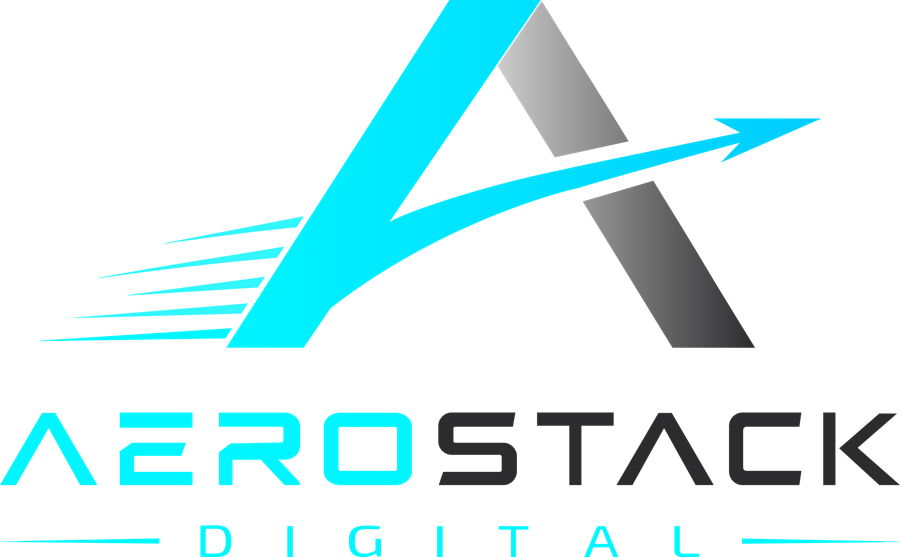
The mark
Built for speed.
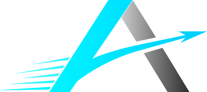
A two-tone A
One leg in electric cyan, the other in graded titanium grey. The split gives a simple letter depth and motion.
The forward arrow
The crossbar becomes an arrow that cuts through the A and out the other side, pointing the brand forward.
Speed lines
Five tapered lines trail behind the A, so the mark reads as moving even at the size of an app icon.
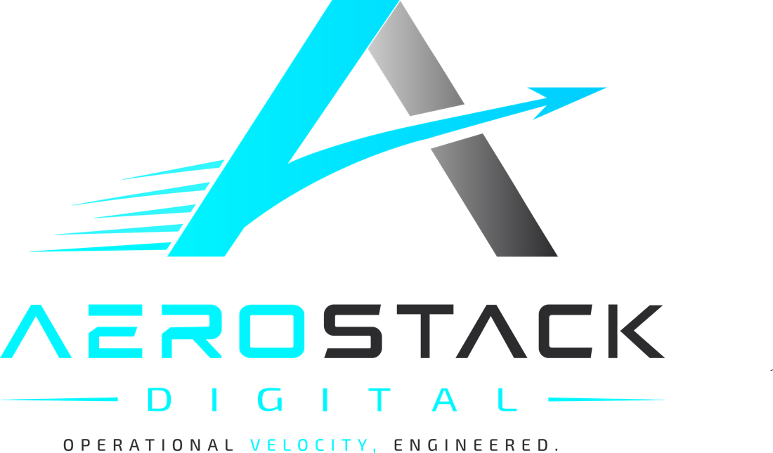
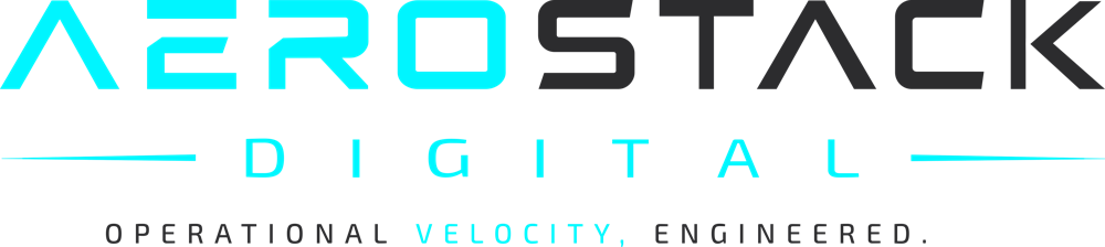
The wordmark
AERO in cyan, STACK in charcoal, with DIGITAL spaced wide between two fine rules and the line "Operational velocity, engineered."
Logo system
One logo, every situation.

Delivered
Ready for day one.
|
Team Member | Job Title
Phone: +27 (0) 00 000 0000
Email: name@aerostack.tech
|
 | |
What AeroStack received
- Full logo set in colour, white and black
- Emblem, wordmark and slogan versions
- PNG and PDF files at 300 DPI
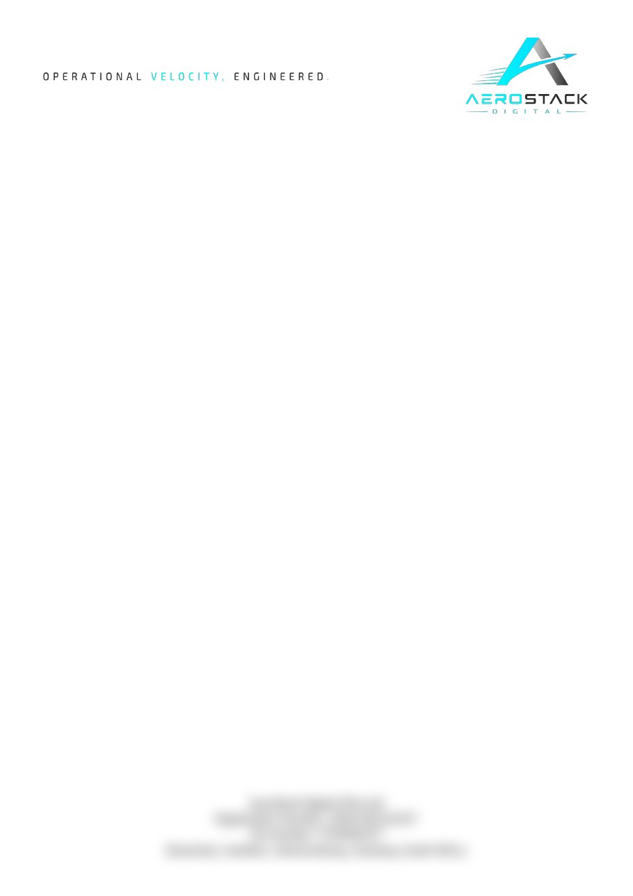
- Letterhead template in Word
- HTML email signatures for the team
- Animated logo reveal video
Own project · Brand & web app
NovaWatch
A free web app for tracking the TV shows and movies you watch, with release-day alerts. Designed and built from scratch, from the logo and app icon to the full installable app.
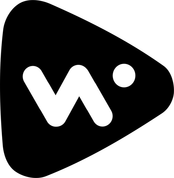
A play button
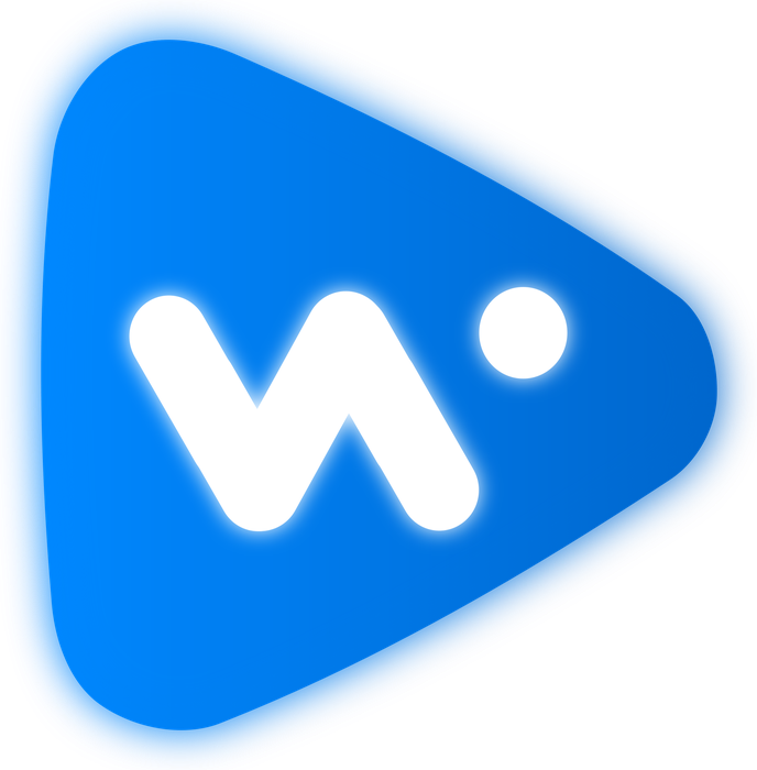
A soft, rounded play button in a blue gradient says streaming and entertainment at a glance.
The N/W monogram
A lowercase n whose strokes carry on to form a w, with a single dot completing the w. N for Nova, W for Watch, in one continuous mark.
A glass finish
A blurred copy of each shape sits behind it, giving the logo a soft, frosted glow instead of a hard shadow.
Made to work small
The same mark works as the app icon, the browser tab icon and in one colour.

Your brand could be next.
Logo, letterhead and email signatures in one package. Identity Pack 1 starts at R3,000.